
Final UI - Design System
Design System & UI kit for Figma To Design Effective Web Apps, MVPs, Desktop apps and much more. Ready-made components and patterns. Professionally designed templates and layout examples with light mode and dark mode
List of UI Kits, Design Systems
Looking for the best Figma UI kits in 2025? We've collected a list of UI kits, Figma templates and design systems for Figma. All in one place. This page showcases the most widely used UI kits available in Figma. These kits represent the highest standards in design. Explore and choose one to save your time!
Resources in this category
Design System & UI kit for Figma To Design Effective Web Apps, MVPs, Desktop apps and much more. Ready-made components and patterns. Professionally designed templates and layout examples with light mode and dark mode
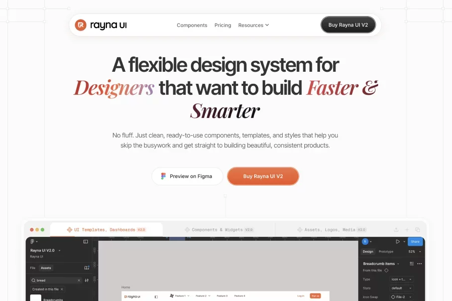
A flexible design system for Designers that want to build Faster & Smarter. No fluff. Just clean, ready-to-use components, templates, and styles that help you skip the busywork and get straight to building products.
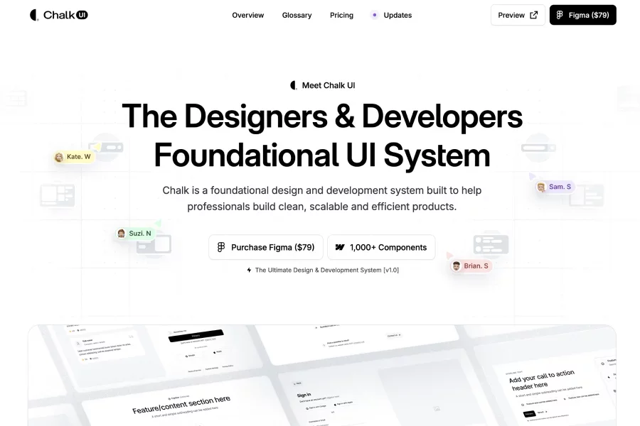
A foundational design & development UI system: over 5,000 components & elements, built for designers & devs to build clean, scalable digital products. Available as a Figma design system (and Webflow / Framer versions via Flowbase Pro+)...

A powerful UI library to design e-commerce web sites, online shops & marketplaces with a huge set of components and templates. Design in Figma and coded version.

UI Wiki offers ready-to-use Figma UI components and web design resources to help designers work faster. The site features 2,500+ UI components and showcases website pages (Home, Careers, Features, etc.) as examples
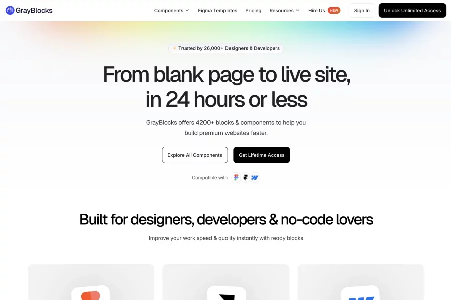
Offers 4,200+ ready-made blocks & components for Figma, Framer & Webflow to speed up website design workflows. Copy-and-paste style: components, templates, UI kits all in one place so designers and no-code users don’t start from scratch.
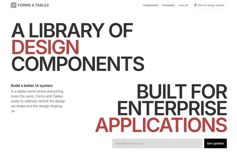
A design system / component library focused on enterprise UI, specializing in high-quality forms, tables, navigation, data visuals and more. Emphasizes a “human-centric” approach and scalable systems suited for complex, data-driven applications.
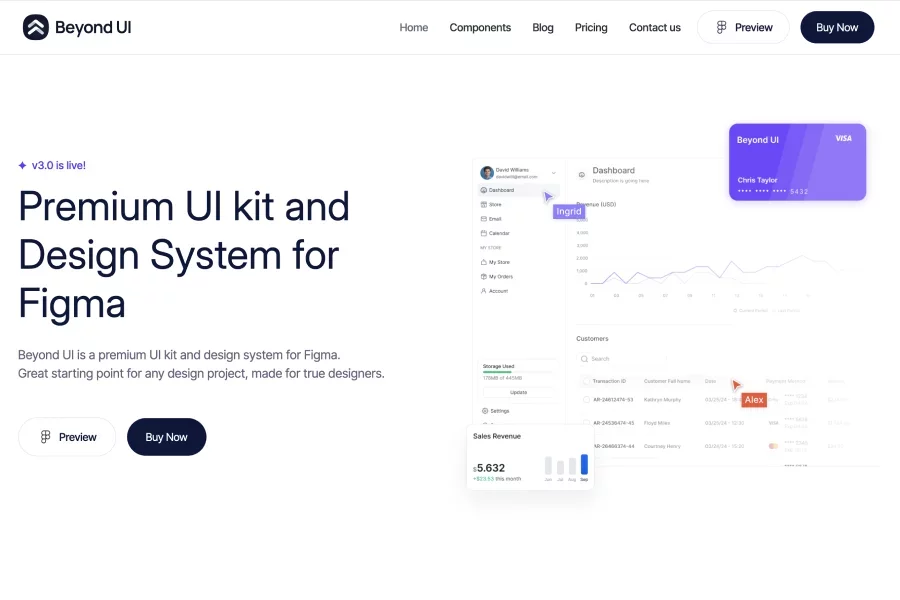
A premium UI kit & design system in Figma featuring 7,500+ components, advanced slot-based layouts, adaptive variables and SaaS templates. Smart component design (nested instances) lets users generate many variations from fewer master components.
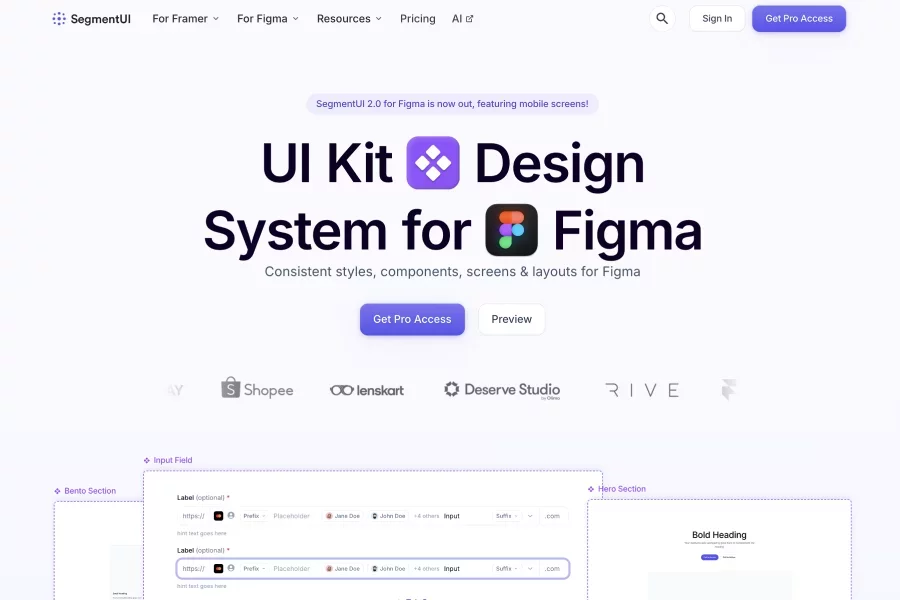
UI Kits and Components for Framer & Figma. Design resource that covers everything from ideation to monetisation. Consistent styles, components, screens & layouts for Figma. Using Figma tokens, swap between light, warm and dark. 500+ Beautiful Mobile and Web Screens

A starter UI kit for Figma containing interface elements, components, light/dark themes, charts, icon sets etc., made to speed up interface design so you don’t build from scratch

A UI kit & design system for Figma, Framer, and Webflow that helps designers build high-performance websites quickly with prebuilt sections, responsive layouts, and component-based workflow.

A modern design system & UI kit built with Tailwind CSS, shadcn/ui, and available in Figma & React — includes many pre-made elements (buttons, cards, forms, etc.), icons, theming, documentation.
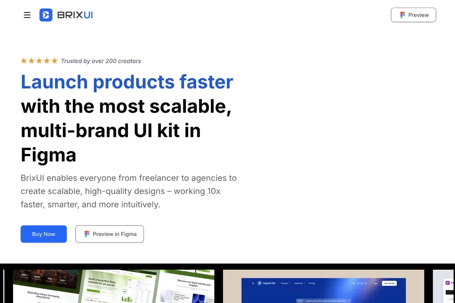
A multi-theme UI library & design system for Figma that emphasizes scalability, responsive components, light/dark themes, and lot of layout flexibility (e.g. using Figma Auto with min/max-wrap etc.).

An online store offering high-quality UI kits and design resources: templates for Figma, Sketch, Framer, etc., bundles and theme-based product categories like SaaS, Crypto, Dashboard, etc

UI kit for Figma based on the Ant Design React library, with up-to-date components, variables, auto-layout, light/dark theme letting you design and then more easily sync with developer workflows
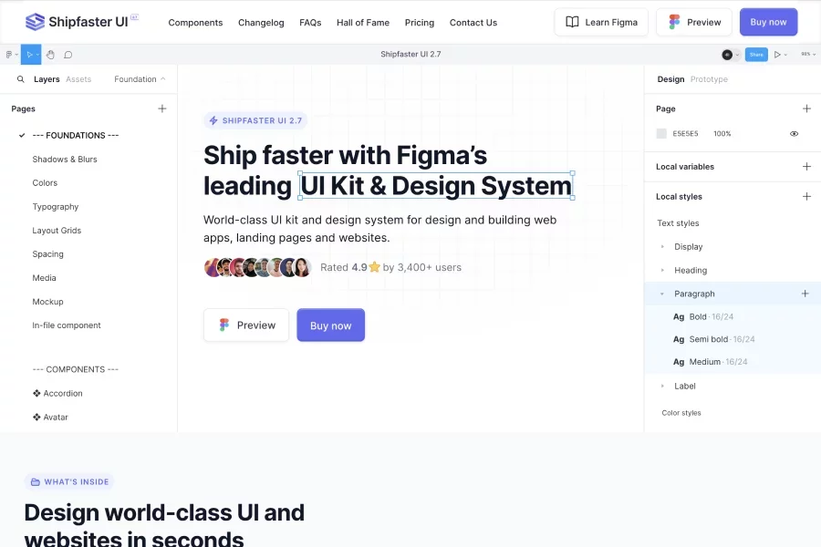
A comprehensive Figma UI kit & design system with 8,000+ customizable components, along with templates, global styles, media assets, aimed at accelerating designs for landing pages, web apps, etc.
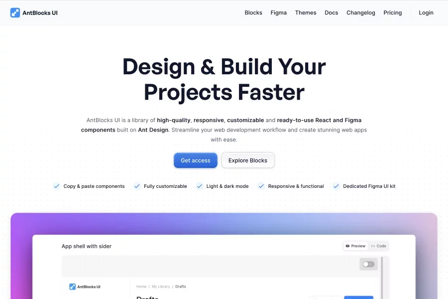
AntBlocks UI is a library of high-quality, responsive, customizable and ready-to-use React and Figma components built on Ant Design. Collection of ready-to-use components, including login forms, sections, panels, and more
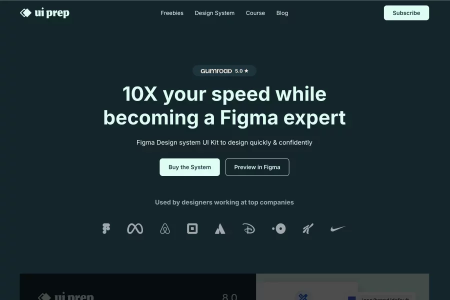
Figma UI kit by UI Prep offering components/templates/design system assets for Figma. 10X your speed while becoming a Figma expert. Figma Design system UI Kit to design quickly & confidently
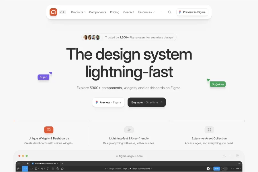
Design & Development perfectly aligned. Explore 5900+ components, widgets, and dashboards on Figma. Ready-made multi-page user flows for apps for HR, Banking, Marketing, AI Products
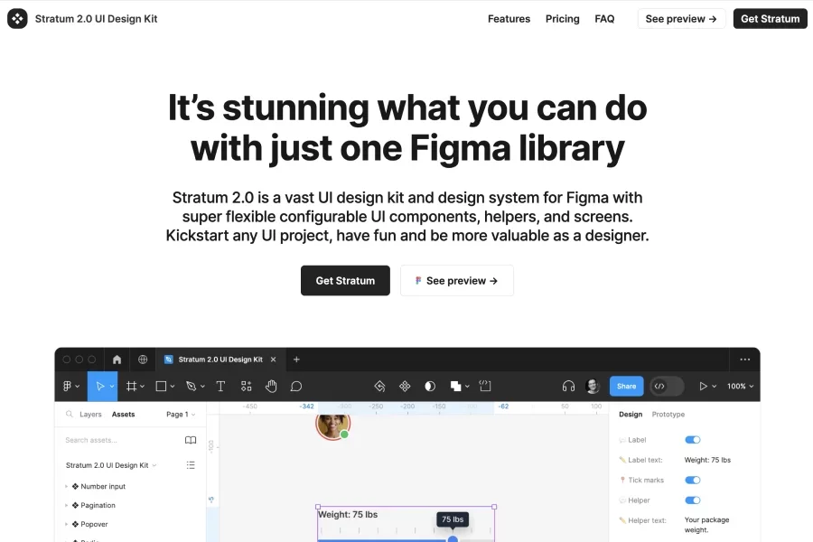
Vast UI design kit & system for Figma with very flexible, configurable UI components, helper elements, and example screens to kickstart projects. Helps designers “build like lego” — consistent components, layouts, variants, so UI creation is faster & more modular.

Comprehensive UI library & design system with variants, Figma token variables, built-in dark mode; good for both designers and developers wanting clean handoffs.
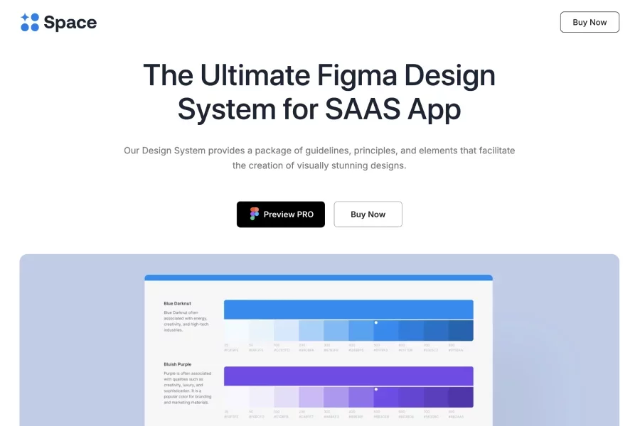
A Figma design system made for SaaS apps: thousands of reusable components, global styles, templates, icons/logos and design assets to maintain consistency. Includes typography, iconography & colour palettes, and pre-built dashboards/templates

Design system built for Figma with variables, auto-layout, nested instances etc — lets you adjust parts easily, switch items/text, and maintain design consistency via design tokens.
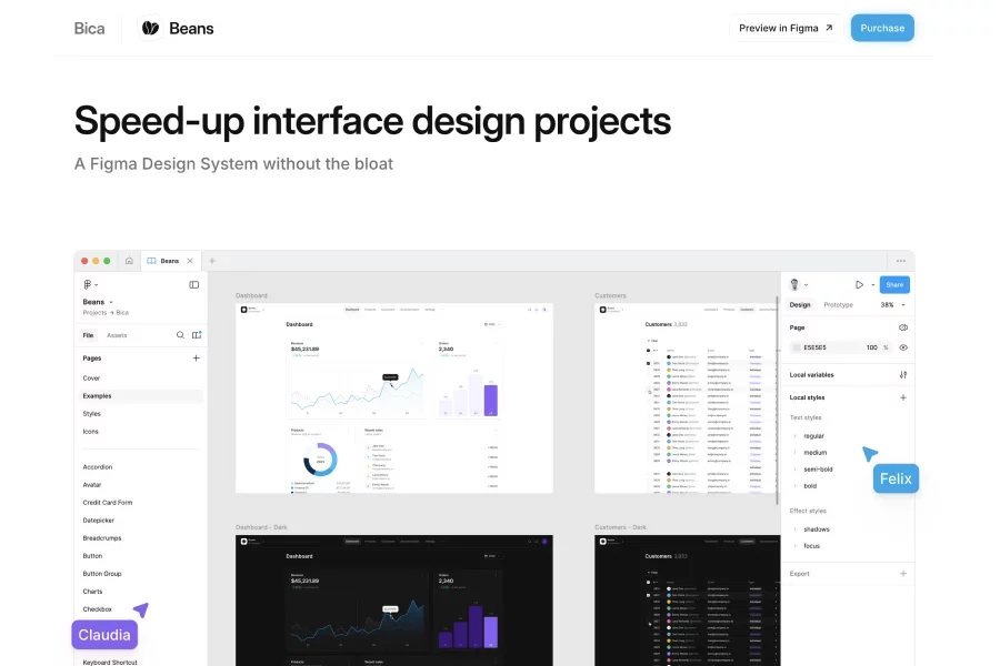
A Figma Design System without the bloat. Speed-up interface design projects. 4.5k+ reusable components. Example product design included
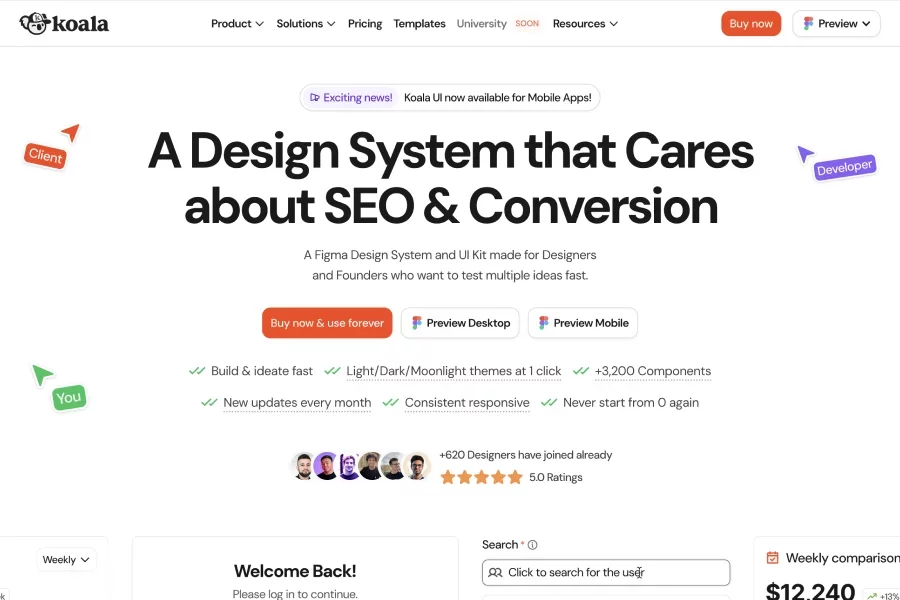
A design system / UI kit aimed at designers & founders who want to test multiple ideas fast: pre-made sections & components for marketing, product apps, and more. Features include light/dark themes (and more), regular updates, free starter assets & illustrations, plus premium full kits

A comprehensive Figma design system with 7000+ components, many templates and dashboards, built to accelerate workflow and consistency in design projects.
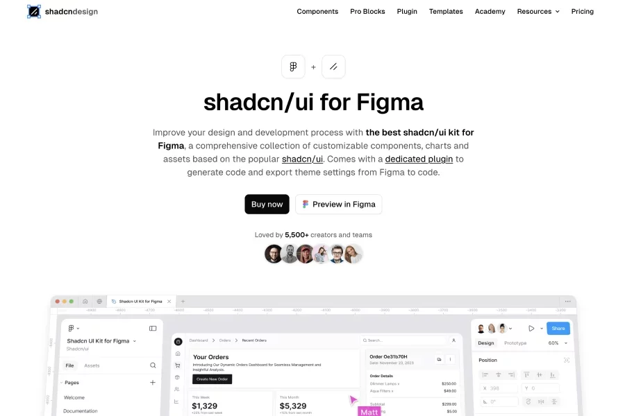
The “shadcn/ui kit for Figma” offers a large collection of customizable components, charts and assets based on shadcn/ui, with a Figma plugin that exports theme settings and code.
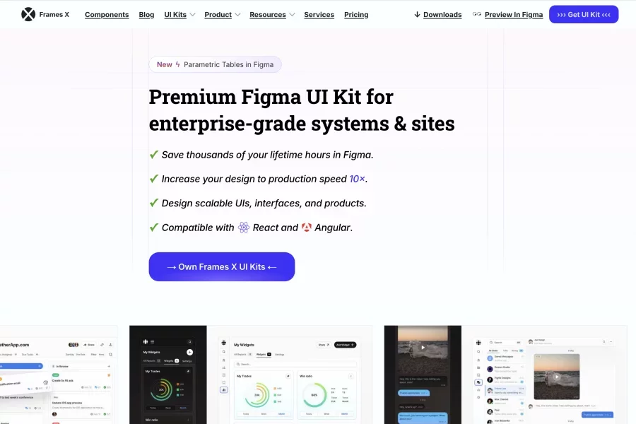
Premium Figma UI Kit for enterprise-grade systems & sites. Frames X UI Kit includes everything you need to design world-class products and scale your business without the complexity of building your own design system.
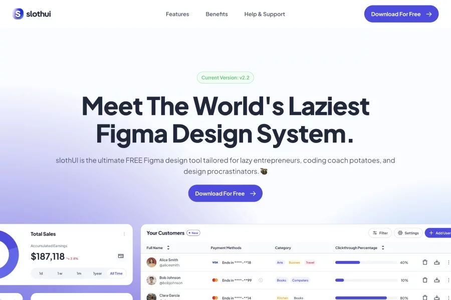
A free (with paid upgrade) Figma design system/ UI kit built for people who want to design “the lazy way”—minimal setup, global styles, auto-layout, responsive, focused on simplicity and speed.
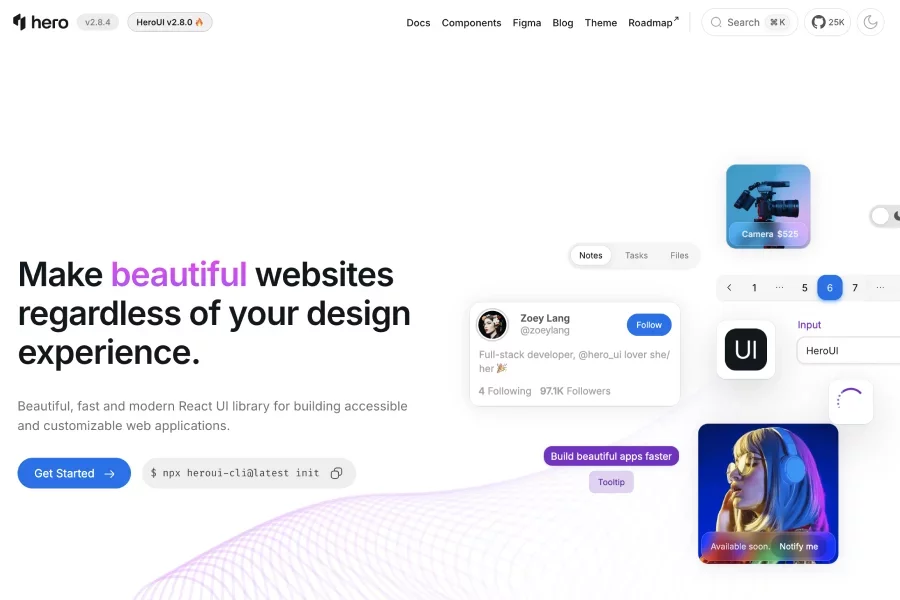
Figma kit so designers can prototype with the same component styles, typography, and colors used in code. Offers React UI library built on Tailwind CSS + React Aria, focusing on accessibility, themeability, and performance—letting you build “beautiful, fast and modern” web apps.
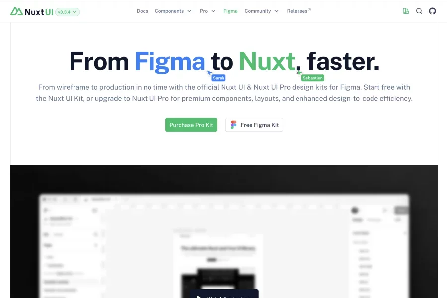
Official Nuxt UI & Nuxt UI Pro design kits for Figma: includes production-ready components, local variables, auto-layout, variants; helps move from wireframe to code faster.
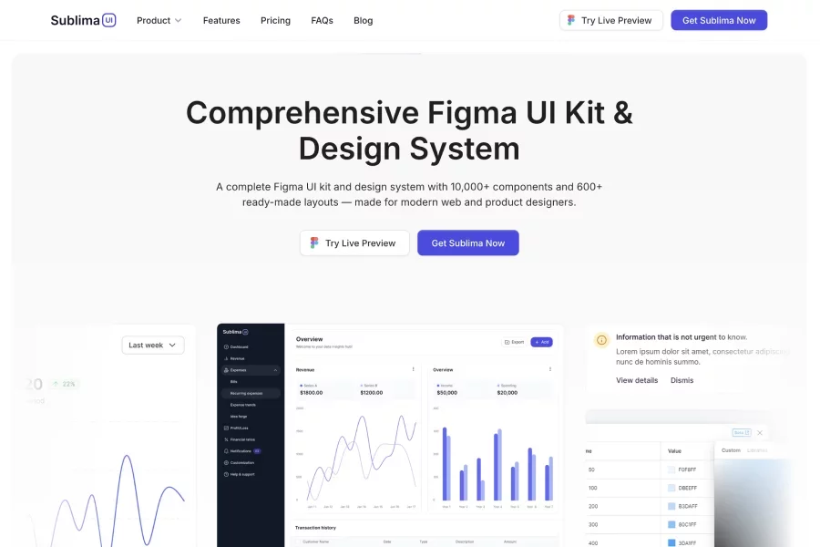
A comprehensive Figma UI kit & design system with 10,000+ components and 600+ ready-made layouts, built for web and app designers who want speed and consistency.
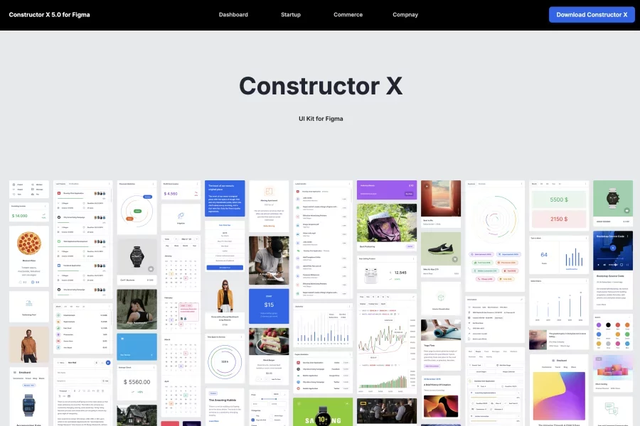
A large Figma UI kit & design system (Constructor X) with many screens, components & variants for dashboards, startups, commerce etc

Figma template + builder kit specifically for e-commerce stores: over 100+ pages, 230+ sections, 1.3K+ components; aims to enable building high-end stores quickly.

A collection of Figma templates, UI components, product kits, website flows, and other design assets to speed up design work. Copy / Paste into Figma directly.

FlyonUI offers 1000+ Tailwind Figma component variants, 500+ blocks, 20+ templates, 4 themes & more with an intuitive drag-and-drop builder.

A premium Figma kit offering hundreds of Pro blocks (466+) designed for consistency, responsiveness, and seamless integration with shadcn/ui; includes both desktop and mobile versions. Comes with a complete theme system (color palettes, typography scales, icon sets & design-tokens) so your design aligns with the code-base (Tailwind/shadcn theme variables)

Robust Figma UI kit/design system with thousands of components & variants, strong variable support, auto-layout / modern Figma features, plus 40+ templates
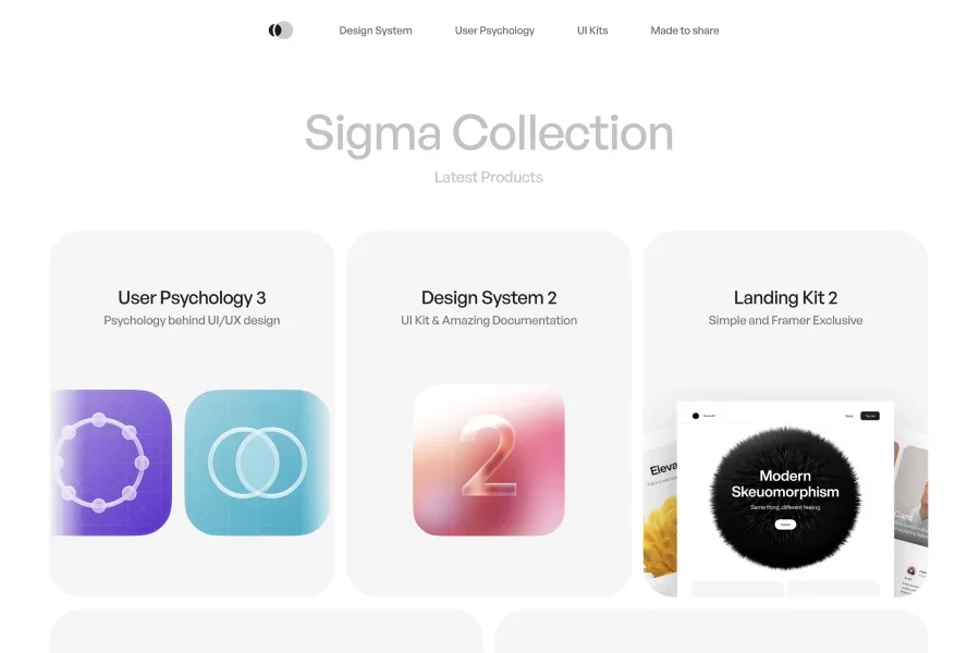
Offers a curated collection of UI kits, design systems, landing and e-commerce kits, with strong UX/UI documentation and focus on visual consistency
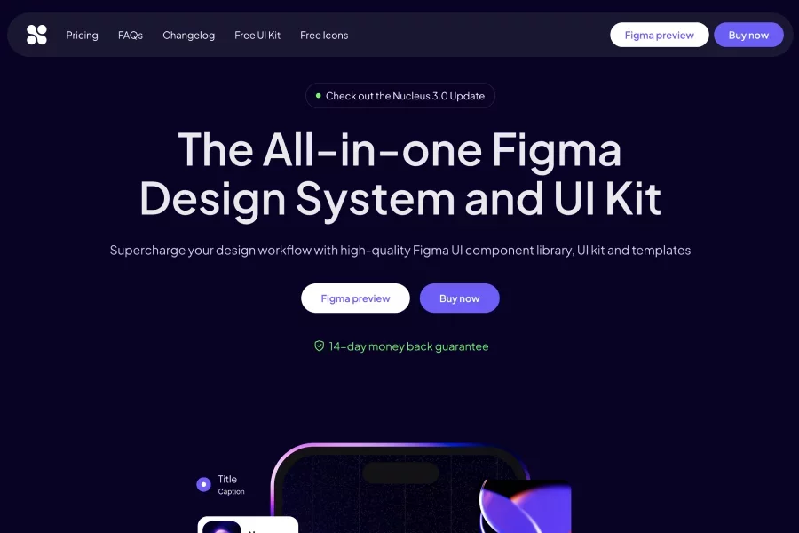
An all-in-one Figma design system & UI kit with templates for web, mobile, dashboards, and more; lots of components, icons, pages, and styles

Provides a collection of high-quality UI resources: design systems, icon sets, data visualizations, Figma UI kits & components.

Full-featured Figma design system that includes responsive website, dashboard, and mobile app templates; includes 3,250+ custom icons and switchable light/dark modes. Also offers a Framer Library for building from designs, many pre-made pages/blocks, and pricing/licensing tiers for individuals and teams

Comprehensive design system + UI kits in Figma: over 23,000 components & variants, plus multiple kits (app, dashboard, website) and icon/logo sets (5,200+ icons).

Minimalist design system / UI kit for Figma; helps speed product design with +2,000 handcrafted components & variants, flexible style customization. Includes a consistent 4 px grid system, lots of layout samples, over 600 open-source icons
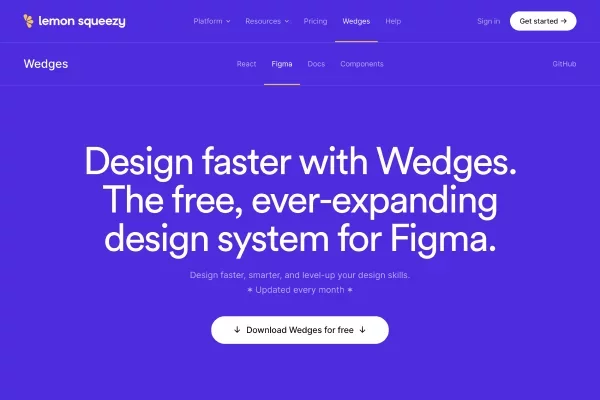
A free Figma design system + UI kit aimed at both beginners and pros, updated monthly with new components and layouts. includes ~200 icons

Free design system for Figma, with Tailwind CSS styles built in; includes >30,000 downloads and light/dark mode support.